
01
CASE STUDY • CUSTOM ART • THE CLINT
Feelin’ Lucky
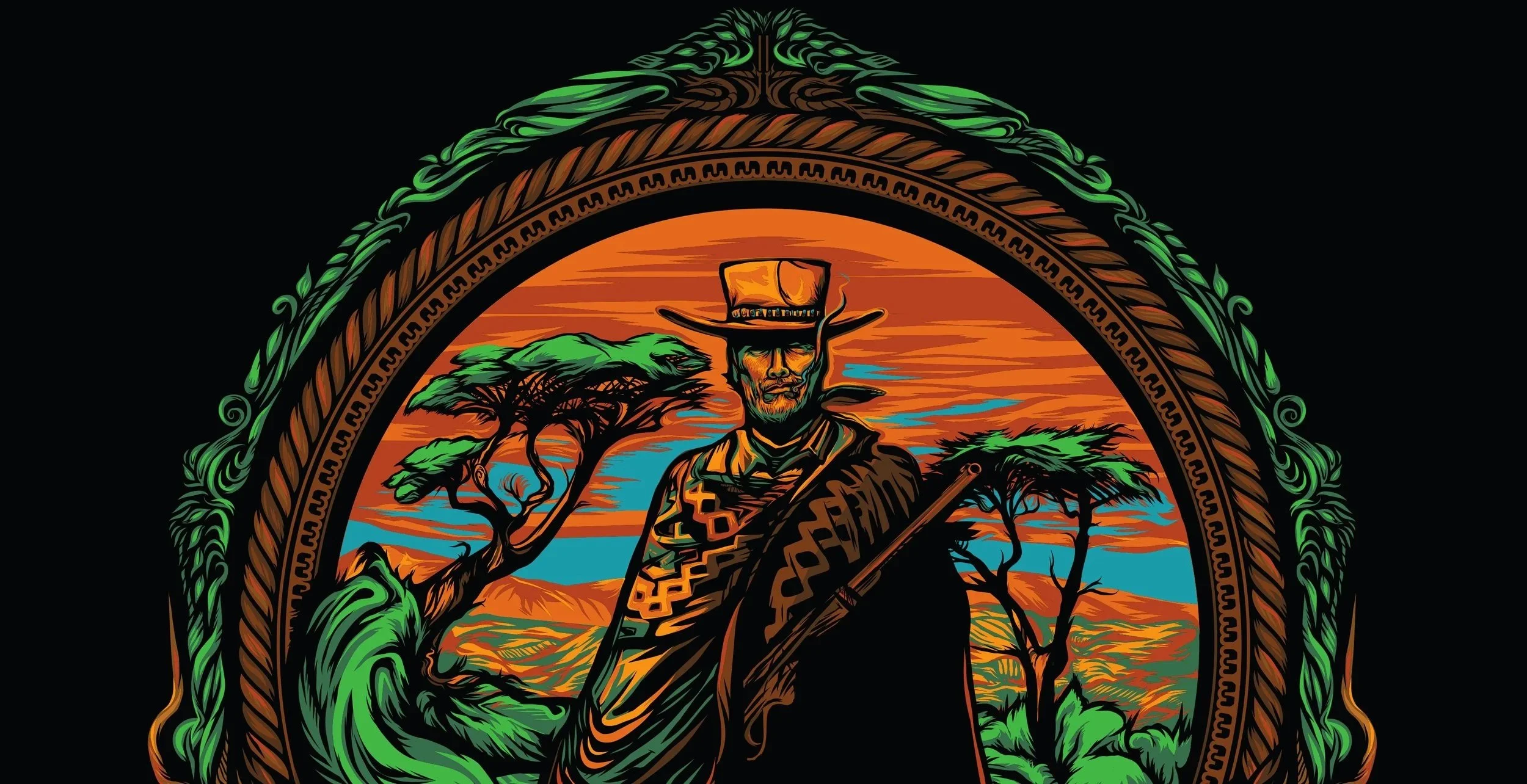
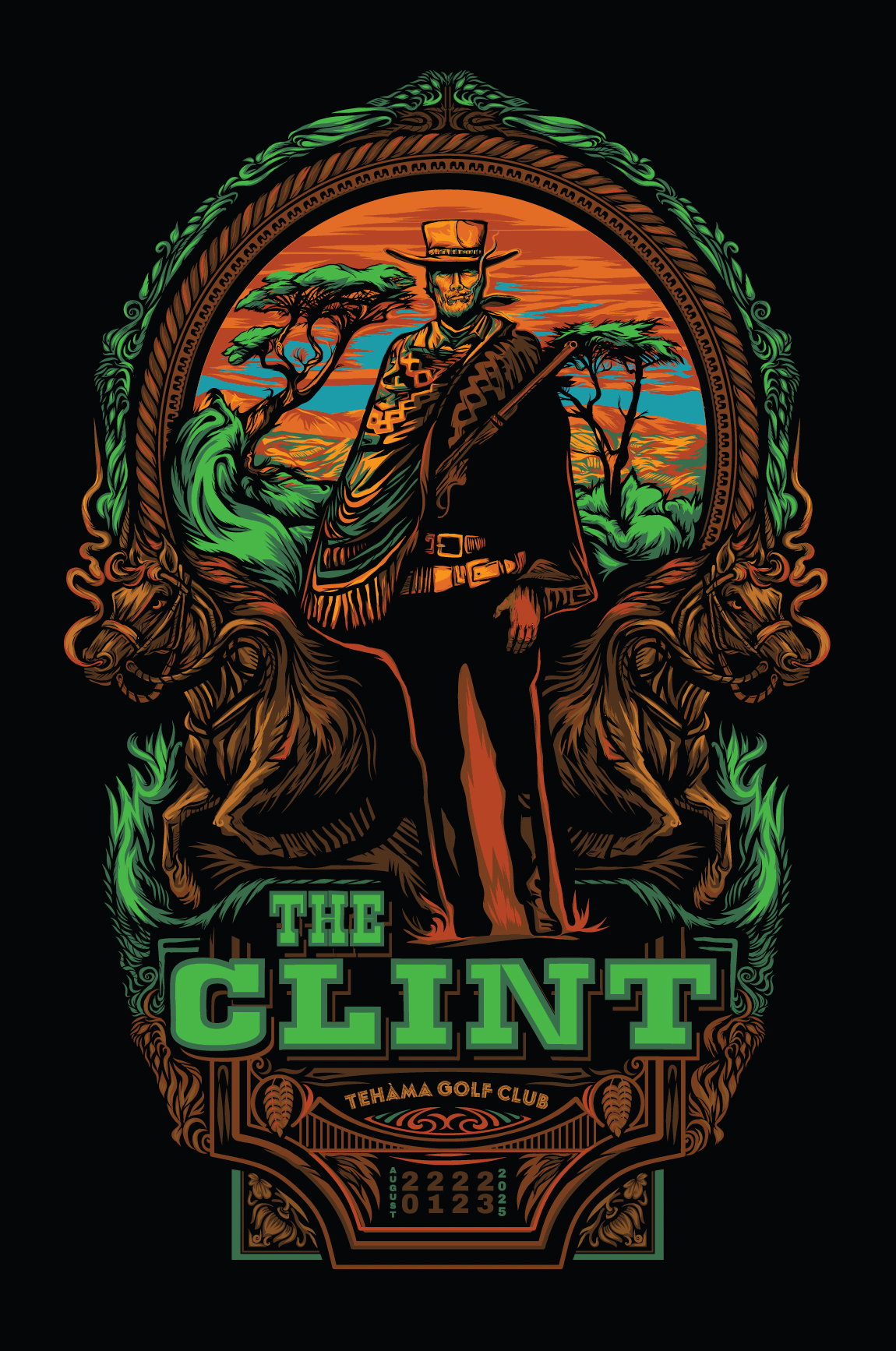
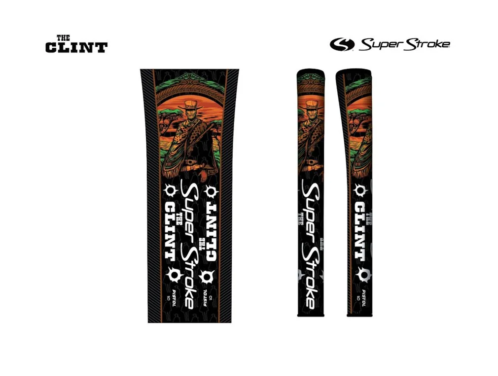
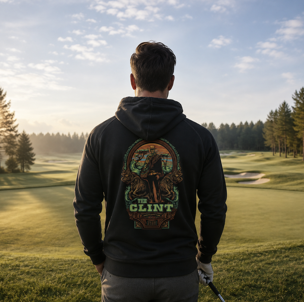
Goal: Develop an iconic but original interpretation of Clint Eastwood, based on the event logo, for the tournament at his Tehama Golf Club. The imagery extended into apparel, marketing, limited-edition signed and numbered posters, and custom SuperStroke golf grips created in collaboration with Tehama.
The Result: A cohesive event experience built around original art, collectible objects and details guests could take home.
Production + Collaboration: I created the hand-drawn art as vector, limited-palette with color separations and production always in mind. I coordinated teams in Missoula, Montana and Carmel, California. Thanks to Conor Ballantyne at Western Sensibility for the tricky pursuit of printing on velvet; Kerr’s Custom Draperies, who cut all 150 posters and hand-burned the edges to seal the fabric. The signed & numbered editions were then sent to Tony’s Frame Shop in Carmel where guests could select either black or brown frames.
02
CASE STUDY • EXPANSION • XPLORER MAPS
Large Catalog. Clean Lines.
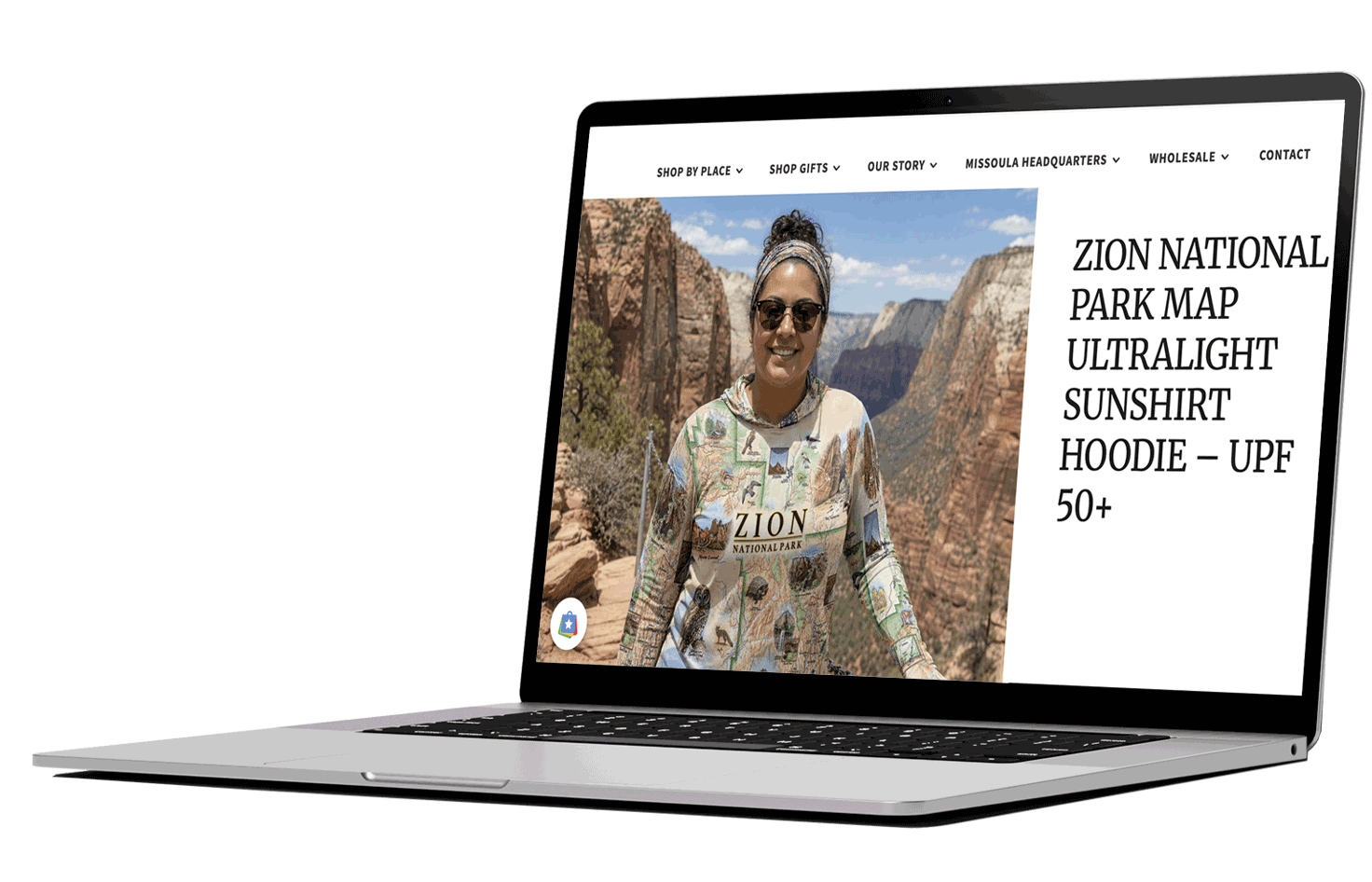
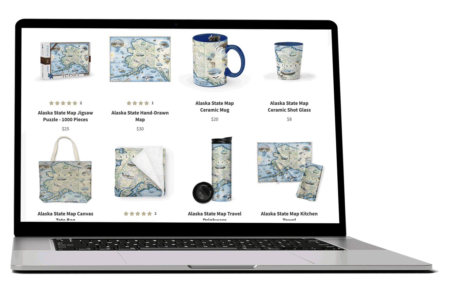
Goal: Transforming Xplorer Maps’ Intellectual Property Library with 65+ hand-drawn fine art maps by Chris Robitaille into a website retail system designed to expand across destinations and product categories without losing the integrity of the original art.
The Result: A growing product catalog organized into a scalable retail ecosystem spanning 60+ illustrated destinations and 1,500+ wholesale partners, supported by the ecommerce and marketing infrastructure built to sell it.
03
CASE STUDY • IDENTITY • ETAIN
From Living Wall To Living Brand.
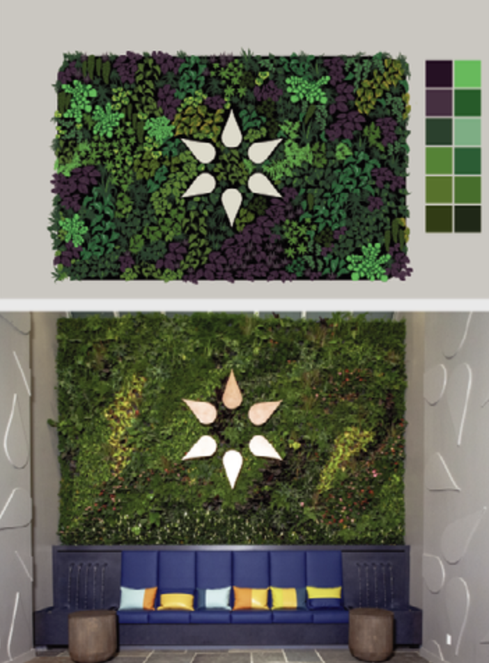
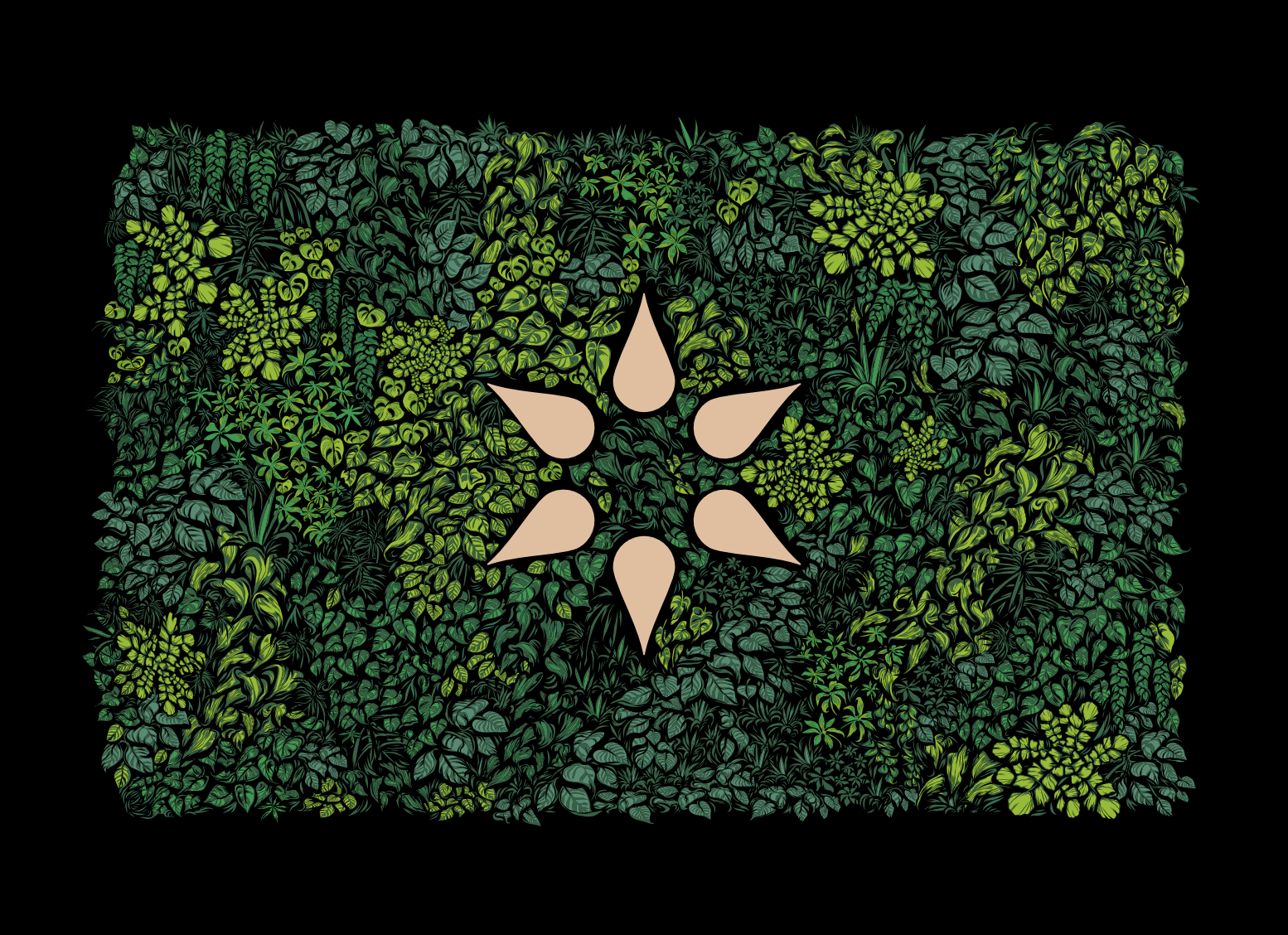
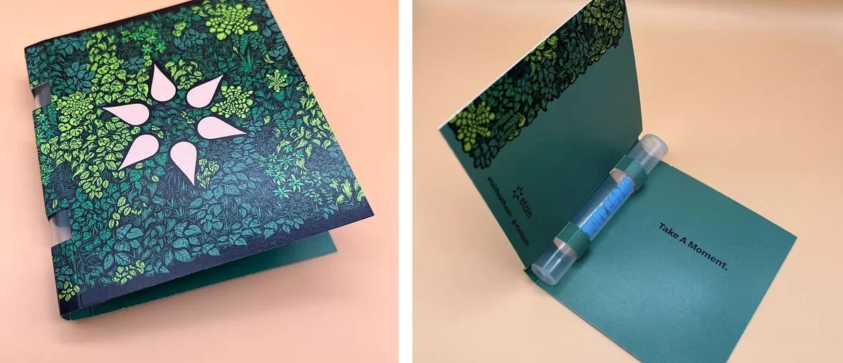
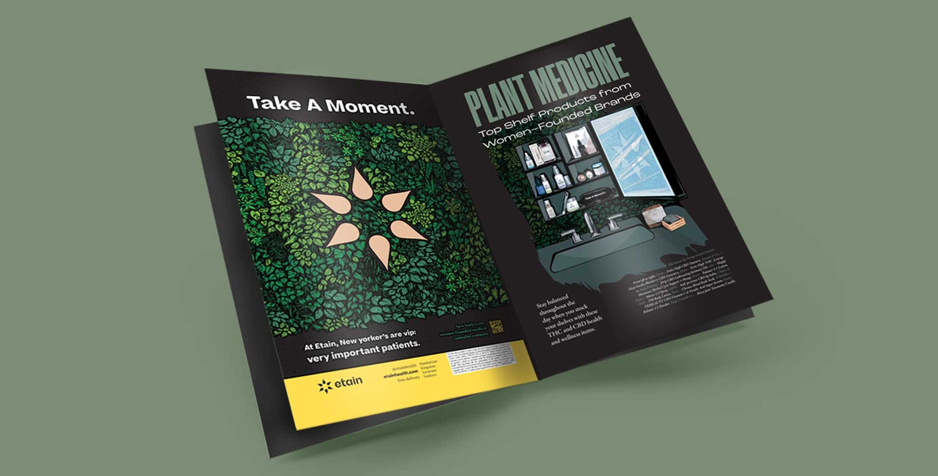
Goal: Turning a recognizable piece of Etain’s Manhattan flagship into a flexible visual system built to function across products, packaging, marketing and customer experience.
The Result: One recognizable brand asset becoming a scalable system capable of generating new products, packaging and marketing. One asset, multiple revenue and brand applications.
One Visual Language. Multiple Brand Experiences.
Production Thinking
Pretty isn’t enough.
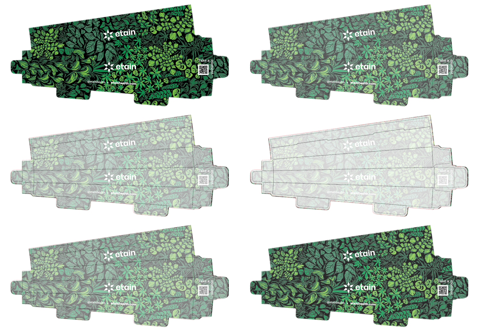
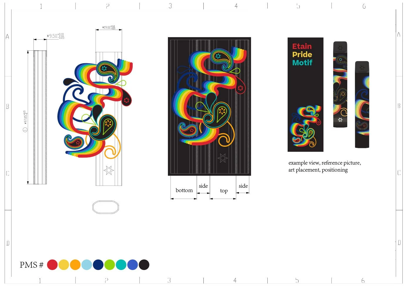
The system also has to survive production.
The modular artwork and irregular shape can wrap complex dielines and accommodate required brand information without losing the visual identity.
Breakdown
-
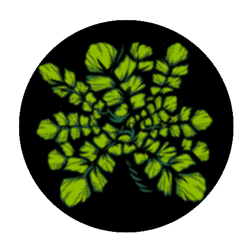
The Core
Identify what already makes the brand recognizable, then maximize it.
-

Reusable
Your Key Art should adapt to various applications.
-

Recognizable
Built from an existing flagship experience instead of adding disconnected visual language.
-
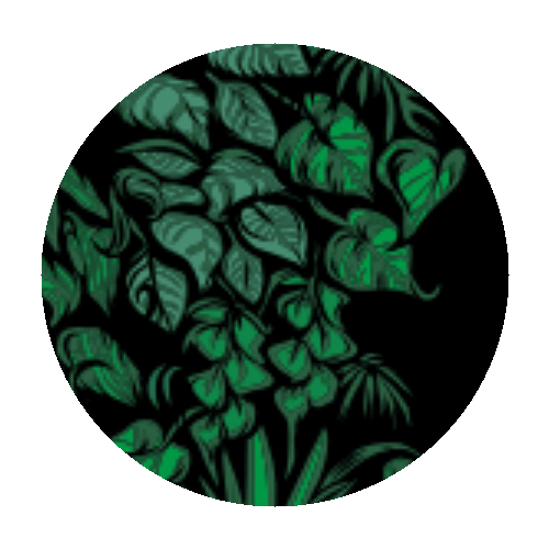
Scalable
Designed to move from small packaging surfaces to environmental and digital applications.
04
CASE STUDY • PRODUCTION • ETAIN
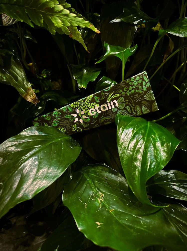
Goal: A limited-edition collaboration designed as one complete experience. The product and packaging became reflections of each other, extending the artwork across every surface.
The Result: A collectible product experience built to generate attention, press and revenue. Covered by Out Traveler.
Product and packaging as one.

Concept → Mockups → Dielines → Production → Market
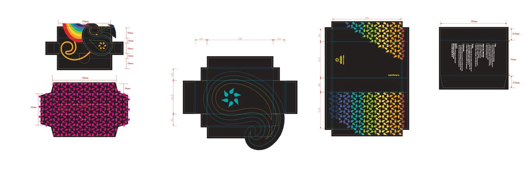
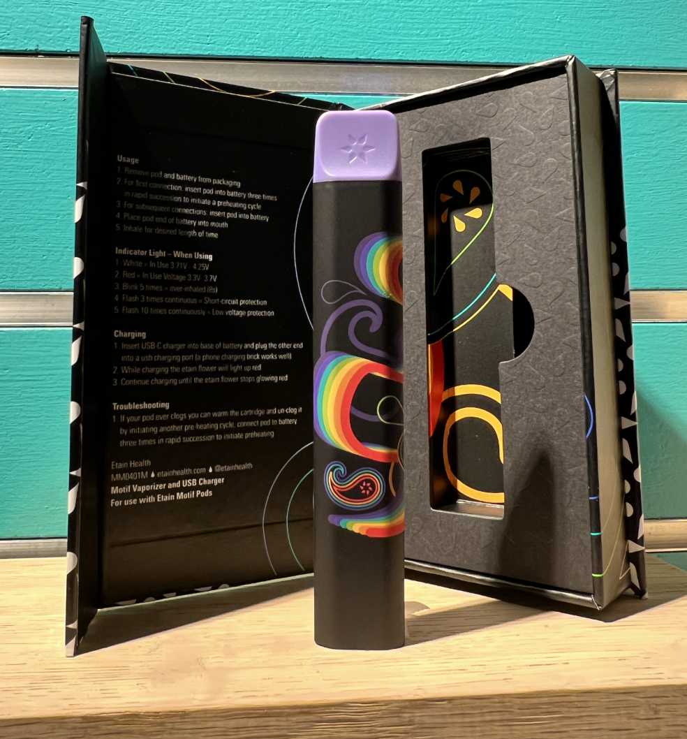
When beautiful, authentic art is useful, it can pay for itself.
I like making beautiful things. I like it even more when they solve a problem, create an experience, and make somebody money.